Consumer App
Shipped
Product Design
The Information Was Good. Trust In It Wasn't
Designing "Verified by Sociability", a trust cue for accessibility information that Disabled people plan their lives around.
A small mark, three decisions, and the two that are still live in the app two years on.
ROLE
Product Designer
TIMELINE
2024・one sprint
Team
Sociability
Surfaces
iOS & Android app・Desktop app
THE PROBLEM
Sociability's accessibility data was detailed and hard-won, but nothing told users whether a place had been checked or when. Good information was quietly losing its authority.
THE SOLUTION
A verification cue that answers two questions at a glance, who checked this and when, shaped by lightweight community polling and internal design review.
THE OUTCOME
The two decisions the community signal pointed to, the “Sociability verified” wording and the verification date, are still live in the app two years and a full rebuild later.
SEE IT LIVE
01 - OVERVIEW
The one thing the app had to earn: trust
Sociability helps Disabled people find places they can actually get into: step-free entrances, accessible toilets, the details that decide whether a trip is possible at all. All of that rests on one fragile thing: believing the information is right.
My brief looked narrow on the surface and was load-bearing underneath. Add a check that tells users a place accessibility details have been verified and make it something people genuinely trust, not just another badge competing for attention. The artifact was small: a mark, a label, and a date on a card that already existed. The decisions behind it were not.
I led the design of how verification would look, read, and behave for users. This case study is about those decisions and which of them proved durable enough to outlast a full product rebuild.
02 - CONTEXT & PROBLEM
You can't trust what you can't verify
Sociability is an accessibility platform where a mapping team documents places in real detail, and Disabled users lean on that detail to plan. By 2024 the data was rich but the app gave users no way to gauge how much to trust any given entry. Was this checked last week, or two years ago? By Sociability, or by a passer-by? The information was good; confidence in it wasn't keeping up.
For most apps, stale data is an annoyance. Here it's the difference between leaving the house and not. If someone travels across the city on the promise of a step-free entrance that turns out to be wrong, the app hasn't inconvenienced them, it's stranded them.
The gap was provenance and recency: nothing showed who had checked a place, or when. Without that, cautious users second-guessed the app, and the information the mapping team worked hard to get right quietly lost its authority.
How might we...
"help users trust a place's accessibility information before they rely on it by showing who verified it and when?"
Scope - how we drew the line
03 - RESEARCH & DISCOVERY
Two signals, kept separate
I pulled from two very different sources and I was careful not to treat them as the same thing.
Internal review. I studied how our own product already handled trust. Earlier “My Sociability” work had introduced a “Last updated” date on place cards, doing quiet, effective work: recency as a credibility signal. That became a foundation if a date already reassured users, verification could build on the same instinct rather than invent a new one.

My Sociability” place card showing the “Last updated: Nov 2023” treatment
Community polling. Through the Sociability Instagram, I ran a set of polls and open questions, putting badge directions and wording in front of the Disabled community that uses the app. A fast, lightweight read by design, enough directional signal to steer the calls that were still open, without slowing a one-sprint feature to a research halt.


The Instagram poll screens: the close-ended polls that shaped the design direction
didn't notice the first badge direction at all. A trust cue that isn't seen isn't a trust cue, this redirected the whole visual approach.
preferred “Sociability Verified” over a bare “Verified.” Authorship mattered, people wanted to know who was making the claim.
said the verification date made them trust the information more. The clearest signal in the project.
Other questions split near-evenly. Where the community had no clear preference, the decision was mine to make, resolved in design review, on pattern consistency and what the mark actually needed to do on the card
04 - IDEATION
Four ways to say "you can trust this"
The mark had one job: be believed at a glance under real constraints. It sat on an already-busy place card; it couldn't add clutter for screen-reader users, and it had to survive being shrunk into a list. I explored four directions. None was decided by the poll alone; the community leaned, the team debated, and the near-even splits meant the call came down to which direction carried the meaning most honestly, without overpromising.


Sociability pin
Cut
Reusing our brand pin. It failed a basic test: the orange pin already means “location,” so a second orange pin blurred two meanings. Signal collision.

Seal check
Revised
The “verified” convention people recognise from elsewhere. Well understood, but the colour raised accessibility and contrast questions in review.
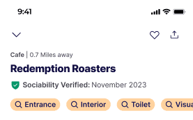
Shield badge
Cut
Read as authoritative and a team favourite. But some worried it could be misread as a formal accessibility certification, which it wasn't. Wrong promise.
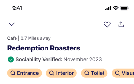
Check circle
Cut
The simplest, clearest read of “confirmed”, but plain enough to get lost against the tags. The direction the polls and the room kept circling back toward for legibility.
2024 concept explorations. Colours and forms shown here are from the sprint, not the mark that later shipped (see Evolution).
05 - DECISIONS
Three decisions that had to hold
01
Make it impossible to miss
The first direction lost because people didn't see it. So the mark had to earn attention on a crowded card, without shouting over the accessibility tags that matter more. Prominence with restraint, not decoration.
02
Say who verified it
“Verified” is a claim with no author. “Sociability Verified” names the source, and the community told us plainly that authorship was the thing that turned a badge into trust. Wording was a design decision here, not a copy afterthought.
03
Show the date
The strongest, clearest signal in the whole project: people trust information more when they can see when it was checked. Like a best-before date, recency does the reassuring, so the verification date shipped alongside the mark, not buried behind it.

Research poll
06 - WHERE IT LANDED
What lives, two years on
The clearest measure of this work is something anyone can open the app and check today. The two decisions the research pointed to most strongly are still in production:
Places carry a "Sociability verified" label, the authored wording, not a bare "verified".
Every verified place shows the date it was checked
Two years and a ground-up rebuild later, both calls are still how the feature works. Nobody preserves the parts that didn't matter.
Verification in the app
07 - EVOLUTION
What survived the rebuild
2024 · THE SPRINT
The two calls at the core
The “Sociability verified” wording and the verification date pointed to the decisions the community signalled.
LATER · NEW DESIGN SYSTEM
The mark was refined
As the team rebuilt the product, the mark moved from the seal-and-green direction we’d explored to the brand blue. The visual was styled to fit the new system.
2026 · TEAM EXTENSION
The concept stretched further
The team later extended it into a separate “community-contributed” variant for community-sourced entries, the same idea applied to a new case.
WHAT HELD
The through-line
Through every one of those changes, the wording and the date carried straight through. The parts of a design that survive a rebuild are the ones that were solving a real problem, not decorating one.

Verification in the app
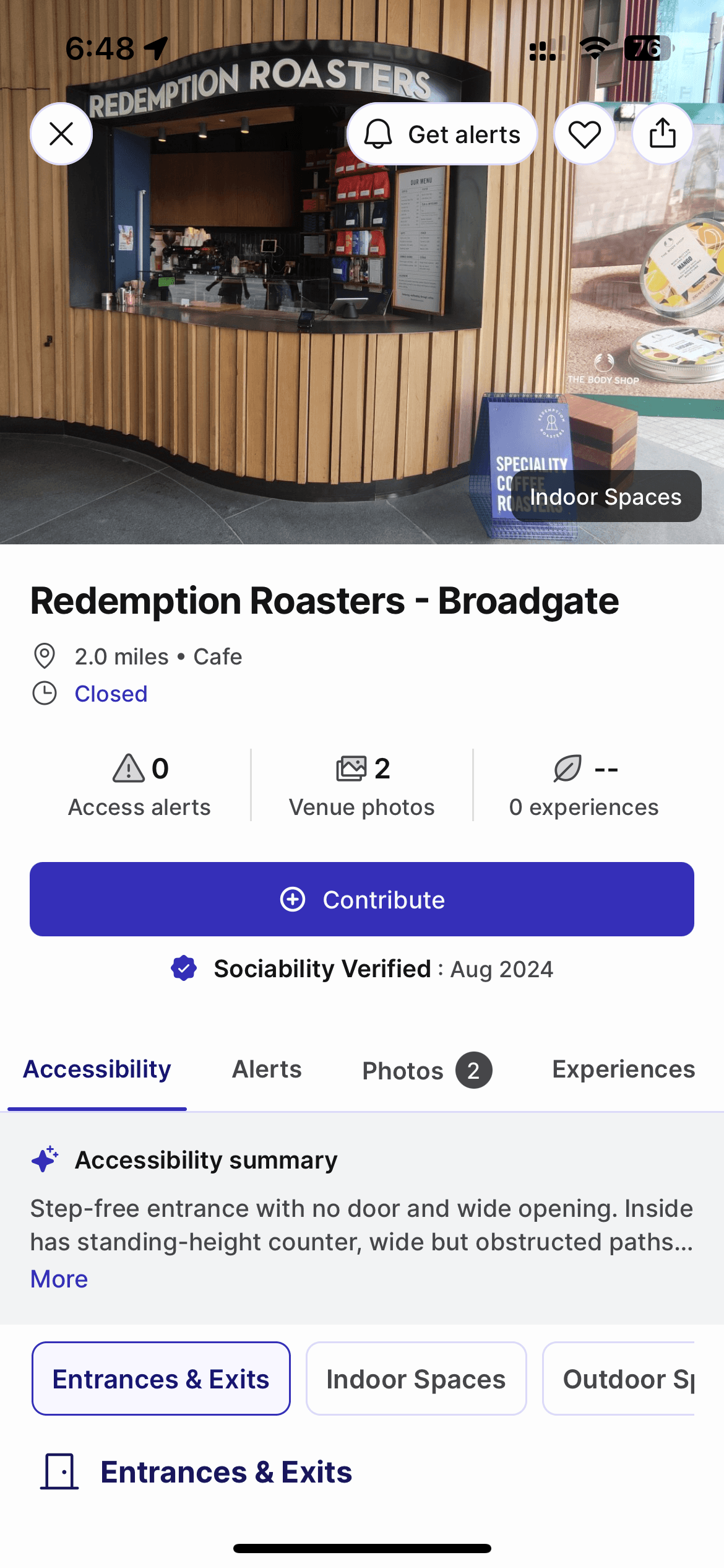
Verification in the app
08 - REFLECTIONS & NEXT STEPS
What I learned, and where it goes next
01
Sound calls on soft evidence
The real challenge wasn't the pixels; it was reading weak signals well. I acted decisively on the three findings that were clear and refused to manufacture certainty from the 51/49 ties.
02
Authorship is what earns trust
“Verified” is a claim with no author. Naming the source “Sociability verified” mattered more to people than the symbol did. Who checked it beat what shape the badge was.
03
Recency does the reassuring
Like a best-before date, showing when a place was last checked carried more trust than any mark on its own. It's the decision that's held longest.
04
Where I'd take the method next
Polls are sharp on what people prefer and quiet on why. The natural next move is to pair them with a few short conversations with disabled users to pressure-test the wording, reaching for the reasoning behind the preference, not just the count.